Below is a list of visualizations that we've developed over time. They are intended for internal use only, and have not been tested across all browsers. For best results, view in Google Chrome.
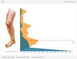
This visualization depicts the change in symptom levels for patients who have received Realief initial care treatment.
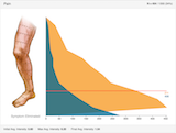
This visualization depicts the change in affected surface area for patients who have received Realief initial care treatment.
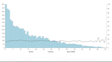
This visualization depicts the frequency of maintenance care.
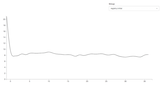
This visualization depicts the RNSS change through maintenance care.
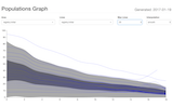
This visualization provides a live version of the registry data.
This visualization compares two patient populations to each other using the RNSS components.
This visualization plots individual patient RNSS total response vs a known baseline population.
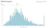
This visualization plots starting and ending RNSS distributions for a population and symptom.
Alternate Versions: Groups